Discover the YouTube Music new icons update bringing fresh, modern, and cartoon-inspired designs. See what’s changed across Android, iOS, and the web.
YouTube Music New Icons Bring a Fresh Look
YouTube Music new icons are rolling out with a redesigned style that feels softer, rounder, and more modern. If you open the app today, you may notice the icons have been refreshed. While it’s not a complete overhaul of the app, the new iconography stands out once you begin using it.

Table of Contents
A Softer Style for Navigation Icons
The first place you’ll spot the YouTube Music new icons is at the bottom navigation bar. The “Home” icon now feels more descriptive, moving away from the flat, sharp-lined design that users were used to. Instead, the style leans toward a rounder and more “bubbly” look.
The “Samples” tab makes this especially obvious, with thicker lines and no thin outlines. Both “Explore” and “Library” also stand out more, offering bold details that are easier to see at a glance.

Updates to Top-Right Corner Icons
In the top-right corner of the app, smaller icons have also been adjusted. The notification bell now has a slightly updated look, and the search icon features a shorter magnifying glass handle. These subtle changes give the interface a more consistent and polished appearance.
Changes in the Now Playing Screen
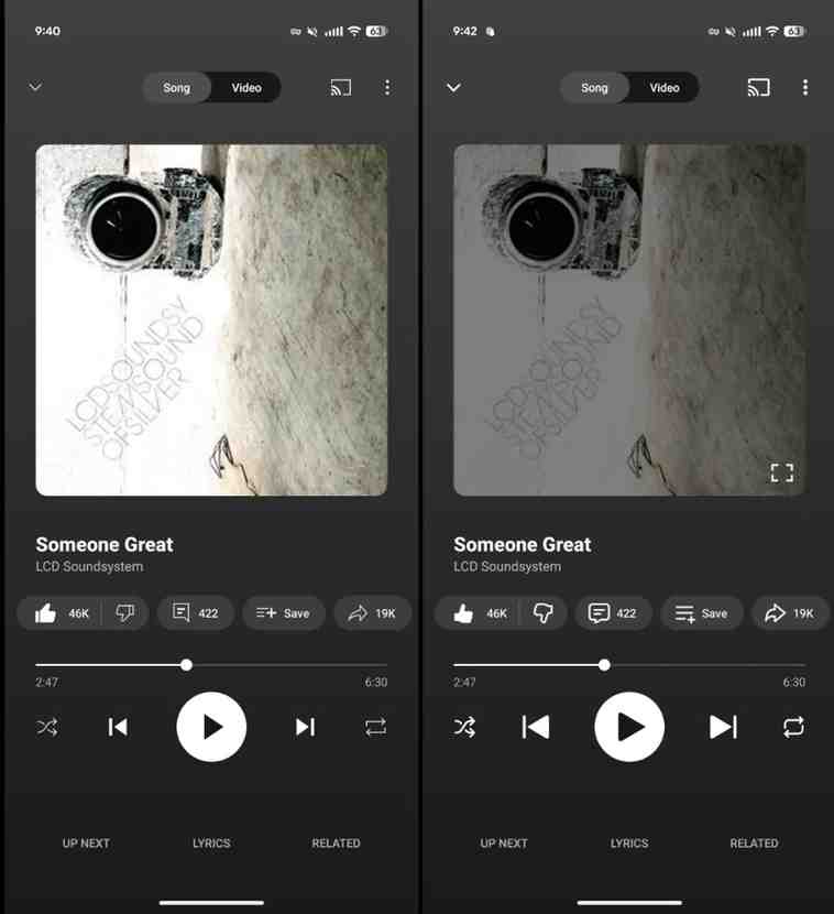
The Now Playing screen shows some of the biggest updates. The downward chevron icon, Cast button, and three-dot overflow menu all have refreshed designs. Even the dots in the menu are thicker, matching the rounder, friendlier vibe of the YouTube Music new icons.

Cartoon-Like Thumbs Up and Down
The most noticeable change is the thumbs up and thumbs down buttons. Instead of simple outlines, they now resemble cartoon hands with visible knuckles—though only three are shown. The thumb is unusually long, making the icons playful but slightly exaggerated. Some may find this fun, while others might think it looks out of place.
Also Read: Amazing Facts About Grand Theft Auto VI 2026: Release Date, Storyline, and Gameplay Revealed
Other Buttons Get a Refresh
Other Now Playing carousel buttons have also been redesigned. The comments button looks more modern, while the play, pause, previous, and next track buttons now feature rounded edges. Shuffle appears bolder, and the repeat button shows the most dramatic update with a noticeably different style.

Overflow Menu and Extra Tweaks
Opening the overflow menu reveals even more tweaks. The album icon feels improved with clearer symbolism, while the new sleep timer icon is simplified into just a circle in some views. The “Pin to Speed Dial” button now has a slight tilt, adding a playful touch.
Gradual Rollout Across Platforms
The rollout of the YouTube Music new icons is happening gradually across Android, iOS, and the web. If you don’t see them yet, try closing and force stopping the app to trigger the update. Some users have even reported similar changes in the main YouTube app, suggesting this is part of a broader Google redesign.
Also Read: 10 Powerful Reasons Google New Operating System Could Beat Windows
A Fresh Yet Divisive Look
Overall, the YouTube Music new icons don’t represent a radical change, but they give the app a fresher, more cohesive style. The old thin-outlined icons were starting to feel outdated, so the update feels timely. Still, not every design choice will please everyone. While most of the icons fit the new aesthetic, the cartoonish thumbs up and down may continue to spark debate.
For now, the YouTube Music new icons bring a lighter, more approachable style. Whether the cartoon thumbs grow on users—or get tweaked again—remains to be seen.